
Interested in advertising on Manebooru? Click here for information!
Hosting an imageboard costs money - help support us financially!
Description:
Auto-imported from derpibooru.org (539453)
Upvotes at import: 65 | Stars at import: 39
Posted previously at: 2014-01-31T14:35:31 | Posted previously by: kleptomage
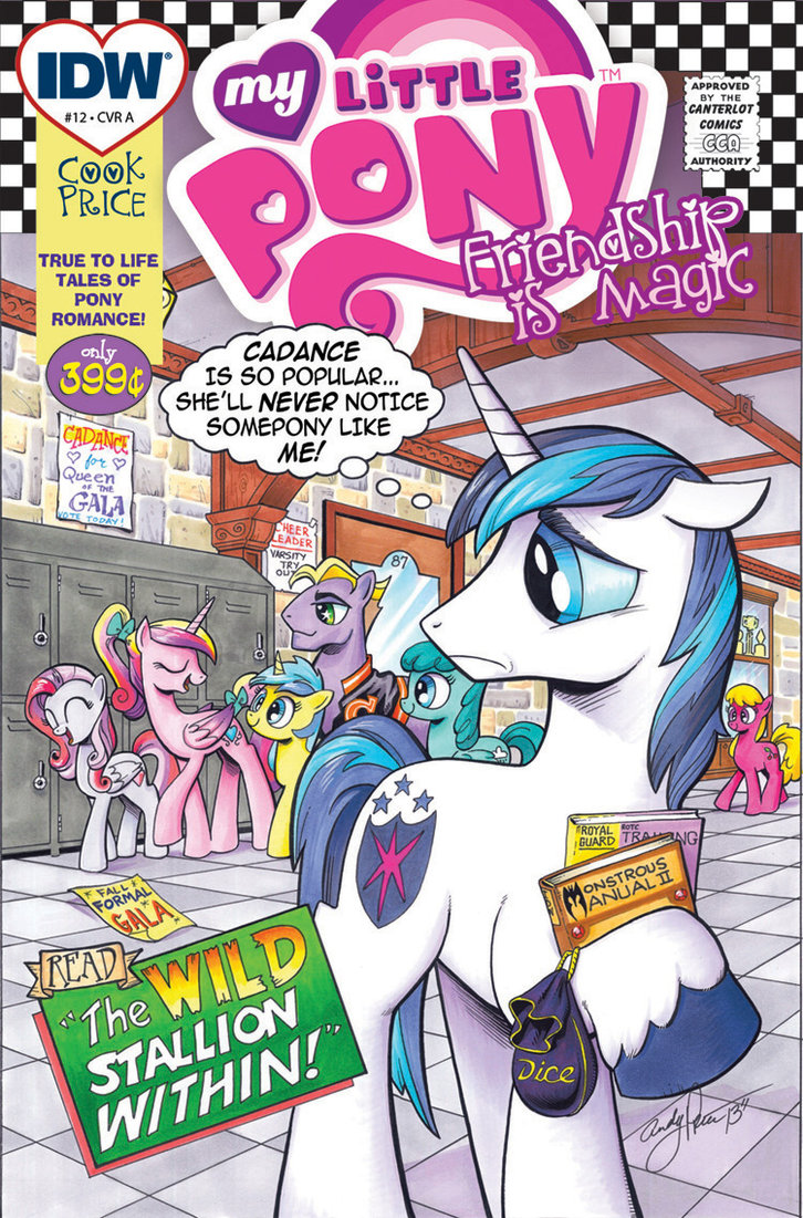
Thought some might like to see the original intentions for the layout on Issue 12. The artwork is the same, but the graphics of the cover were meant to parody the DC Comics romance books of the 1960's… right down to putting IDW's logo inside a heart.
Originally, Shining Armor's word balloon read "a loser like me", and not "somepony like me". It was felt loser was too harsh, so that was changed.
As for the graphics in the layout, the romance approach was believed to be a put-off to readers, that they might feel it was too… 'mushy". The checkerboard and 60's approach were dropped as well… so, the final cover was just the artwork and the MLP logo.
Original artwork- India ink, PITT pens, copic markers, watercolor dyes on 11x17 bristol board.
Upvotes at import: 65 | Stars at import: 39
Posted previously at: 2014-01-31T14:35:31 | Posted previously by: kleptomage
Comments
0 comments posted